4 May 2023
Pure CSS Parallax Using 3D Transforms
So you want to add a bit of spice to your splash page, make it different and not-like-the-other-sites.
I’m not going to sugarcoat it, compatability will be an issue, and if you are relying on a parallax effect as an integral part of your site, you might want to look for a different effect.
With that being said, lets get into it, we’re going to be recreating the parallax effect from my homepage.
If you’d like to follow along, the final codepen is here
Parallax explained
Creating a 3D parallax effect aims to emulate perspective on a web page. As the user scrolls down the page, their perspective is lowered. This creates the effect of things in the ‘foreground’ moving much faster than things in the ‘background’.
For a real life example, look out of your window at something distant while standing up. As you start to crouch down, the window sill appears to ‘move’ much faster than the far off object. In our case, the user scrolling is equivalent to us crouching down.
The Tools
I want to introduce an unlikely tool that will make life MUCH easier for us - Edge. more specifically, the edge 3D View accessed from the devtools.
Although its by no means my preferred browser, this one tool helps visualise layers in 3D css space, which is very useful for ensuring compatability across all broswers.
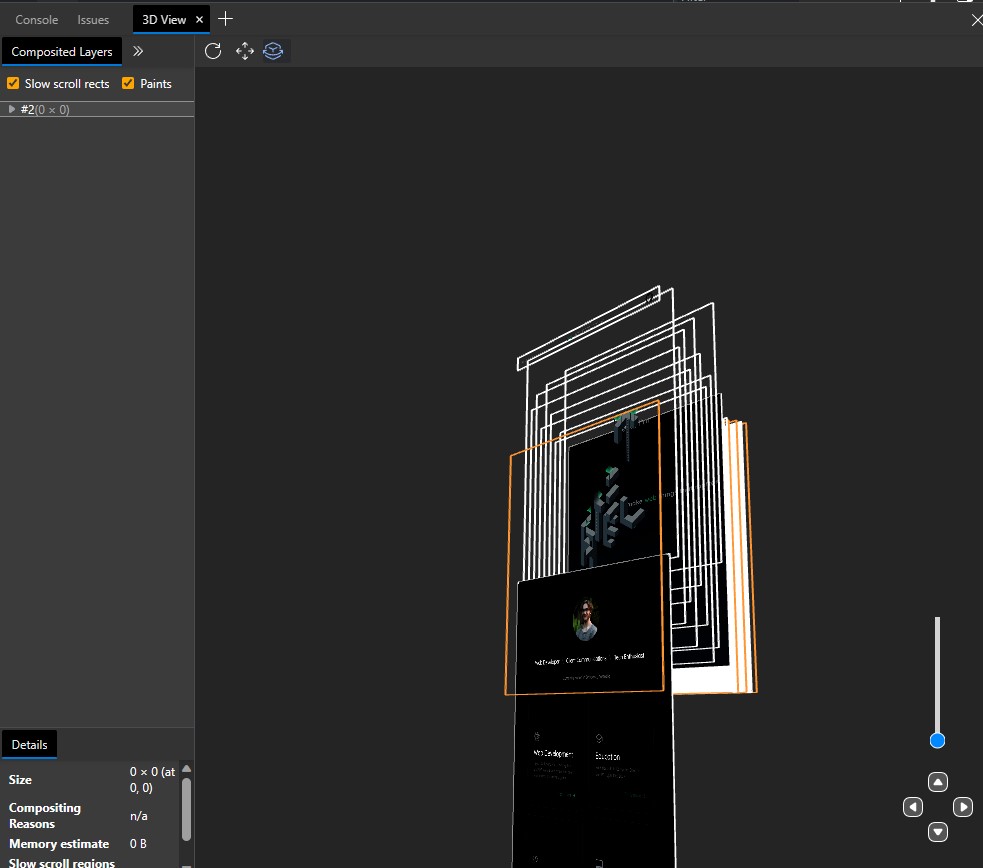
As you can see, I’m able to view each layer of the parallax effect and how they move across the page as I scroll.
Approach
We’re going to split the layers into 3 parts - The background layer, the parallax layers and the content layer.
Background Layer
This layer contains all scrollable content for the page. This layer defines what perspective is used, and every layer is positioned within the 3D space of the background layer. In some cases, this can be the body of your document, but we’ll get back to that.
Parallax layers
These layers contain the parts of the page that move, and are positioned in 3D space.
Cover / Content Layer
This layer is still positioned within the 3D space of the Background layer, however it will be the most ‘forward’ layer, and will usually be positioned at the very front of the page. This is where the rest of the page will be, as unless you want 2 scroll bars, all content needs to be within the background layer.
CSS 3D Transforms
So, how do we place objects further or closer to us? 3D CSS transforms, specifically translateZ.
Lets get started with a simple example:
<div class="parallax">
  <div class="layer layer1">
  </div>
  <div class="layer layer2">
  </div>
  <div class="parallax-cover">
  </div>
</div>
.parallax {
perspective: 100px;
height: 100vh;
overflow-x: hidden;
overflow-y: auto;
position: absolute;
top: 0;
left: 0;
right: 0;
bottom: 0;
transform: translateZ(0);
}
.layer {
width: 200px;
height: 200px;
}
.layer1 {
background: red;
}
.layer2 {
background: blue;
}
.parallax-cover {
height: 200vh;
}There’s a little bit to unpack here.
I’ve set the perspective to 100px. This value can be set to any value you’d like, a perspective of 1px can have the same effect as a perspective of 100px or even 1000px. This value dictates the effect that the translateZ value will have. Higher values allow for more fine grained control over your 3D space without diving into decimals.
The .parallax class is our background layer, it takes up the entire page and allows for scrolling. For the .layer class, I’ve just created some squares. Finally the parallax-cover layer we’ll get back to later, but for now I’ve set this to overflow so we have something to scroll to.
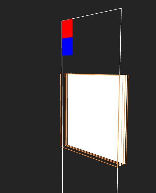
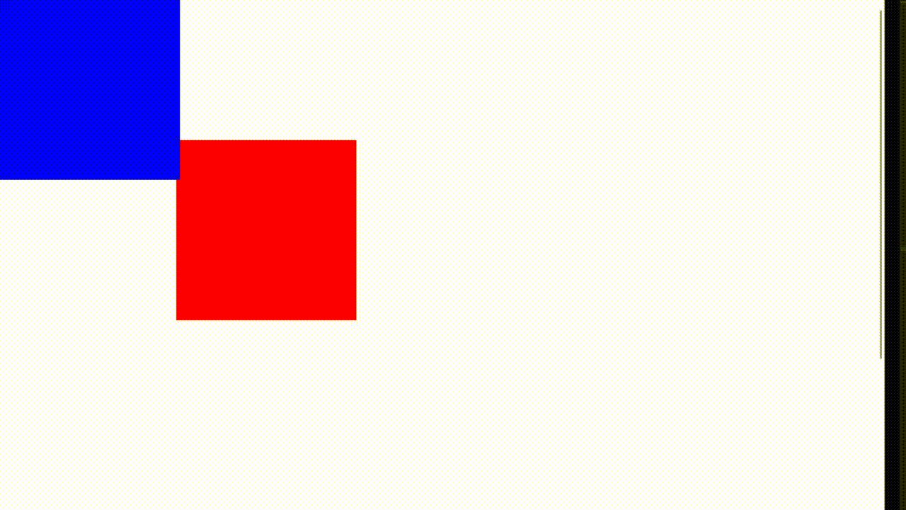
Looking at this on edge shows us what we’d expect. The background layer (white) doesn’t move while the positioned layers do.
Using TranslateZ
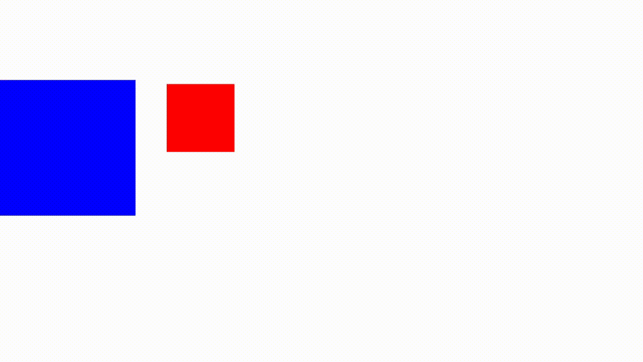
Lets start by moving the red square backwards in the page.
.layer1 {
  transform: translateZ(-100px);
}
Which yields:
Using Scale
You might’ve noticed that the red square has gotten significantly smaller. Just like in real life, the further away something is, the smaller it appears. This size difference is dictated by the perspective and the translateZ value. We can fix this by using the scale function of transforms.
.layer1 {
  transform: translateZ(-100px) scale(2)
}
Scale will be ((translate/perspective) * -1) + 1. In other words, take the value of the ratio between the absolute distance from the page (negative translateZ) and the perspective and add 1.
In this case, that ratio is 1, so our scale is 2.
The rest of the page
Pages generally need content. In our case, that content lives within the .parallax-cover div.
.parallax-cover {
  background-color: green;
  position: absolute;
  top: 100vh;
  left: 0;
  right: 0;
  z-index: 1;
  min-height: 100vh;
}
We absolutely position this content section as full width, offsetting from the top by 1 page height. I’ve also set the minimum height and background color just for this demo:
You can add any content you want within this div, it will appear as the rest of the page.
Making the layers look decent
We’re on the final stretch now, turning our red and blue boxes into somewhat decent looking layers.
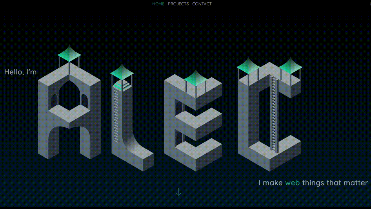
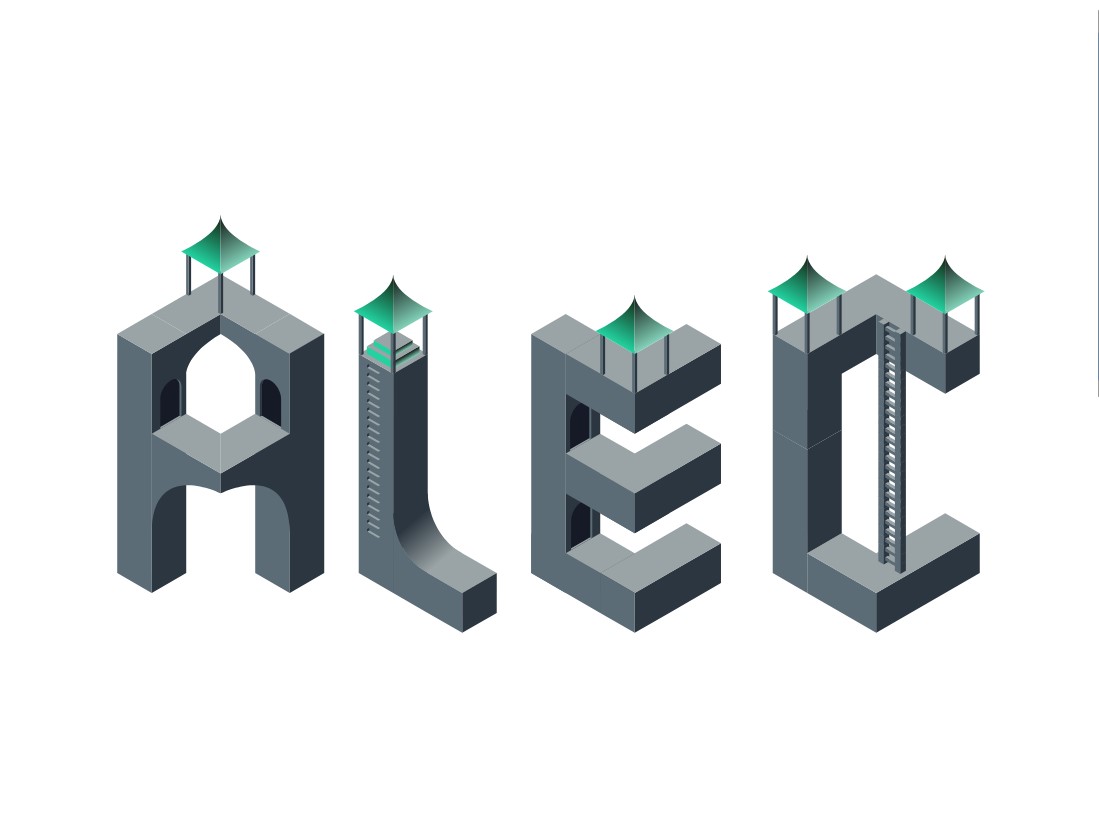
In my case, I created isometric letters in Adobe illustrator, split them in two for a total of 8 layers for 4 letters. The layers can be anything however, with the most famous example being the firewatch website link. But since I’m no artist, I’ll stick to some straight lines I traced and added a bit of detail to.
Here’s a look at our progress after I’ve added the letter layers.
<div class="parallax">
  <div class="layer layer_a1">
    <img class="name-img" src="https://alec.parkes.dev/a1dark.svg" alt="left A" >
  </div>
  <div class="layer layer_a2">
    <img class="name-img" src="https://alec.parkes.dev/a2dark.svg" alt="right A" >
  </div>
  <div class="layer layer_l1">
    <img class="name-img" src="https://alec.parkes.dev/l1dark.svg" alt="left L" >
  </div>
  <div class="layer layer_l2">
    <img class="name-img" src="https://alec.parkes.dev/l2dark.svg" alt="right L" >
  </div>
  <div class="layer layer_e1">
    <img class="name-img" src="https://alec.parkes.dev/e1dark.svg" alt="Left E" >
  </div>
  <div class="layer layer_e2">
    <img class="name-img" src="https://alec.parkes.dev/e2dark.svg" alt="Right E" >
  </div>
  <div class="layer layer_c2">
    <img class="name-img" src="https://alec.parkes.dev/c2dark.svg" alt="Left C" >
  </div>
  <div class="layer layer_c1">
    <img class="name-img" src="https://alec.parkes.dev/c1dark.svg" alt="Right C">
  </div>
  <div class="parallax-cover">
  </div>
</div>
.layer {
position: absolute;
top: 0;
right: 0;
bottom: 0;
left: 0;
width: 100vw;
pointer-events: none;
}
.name-img {
display: block;
position: absolute;
bottom: 0;
width: 100%;
height: 100%;
object-fit: contain;
object-position: center;
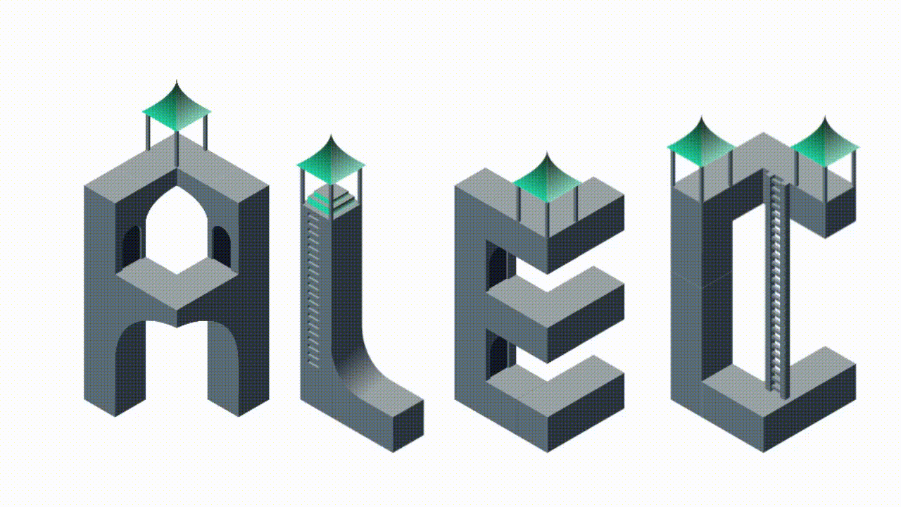
}Which gives us:
You may need to position your images differently depending on how much of the page you’d like to take up and how they should fit in the space provided.
Giving each layer depth
If you’re using a CSS compiler such as Sass, you can make this part look a lot nicer, especially if you’re making something that would have a linear perspective change like a landscape.
In my case, I wanted a bit of a random distribution of which letters scroll at which speed, so I manually tuned them:
  .layer_a1 {
    transform: translate3d(0px,0px,-200px) scale(3);
  }
  .layer_a2 {
    transform: translate3d(0px,0px,-350px) scale(4.5);
  }
  .layer_l1 {
    transform: translate3d(0px,0px, -100px) scale(2);
  }
  .layer_l2 {
    transform: translate3d(0px,0px, -25px) scale(1.25);
  }
  .layer_e1 {
    transform: translate3d(0px,0px, -200px) scale(3);
  }
  .layer_e2 {
    transform: translate3d(0px,0px, -50px) scale(1.5);
  }
  .layer_c2 {
    transform: translate3d(0px,0px, -100px) scale(2);
  }
  .layer_c1 {
    transform: translate3d(0px,0px, 0px) scale(1);
  }
I’m using translate3d here as a substitute for translateZ, where the third argument is the Z. They are interchangeable.
Final Product
Troubleshooting and going forward
Background layers
The biggest problem I ran into was compatability with IOS devices. This stems from how IOS handles stacking contexts differently from other platforms, resulting in some of my layers being hidden. I was able to use the Edge 3D view to figure out which layers were getting placed on top by accident, and it turned out to be because I had set a background on the parallax layer itself.
The easiest solution if your images have transparent elements that require a css background is to create a background layer within the 3D space. Assigning background css to any of the non 3D elements, such as the parent .parallax layer can result in a mess of stacking contexts.
Text layers
Text is fairly straight forward. Absolutely position the text layer just like any layer, and use your preferred css method to move the text around this 100vh 100vw container to where you want it.
Cover / Content 3D position
One thing you might notice is that positioning the content layer further back results in the entire page scrolling slower, and by extension smoother. This creates a better looking graphic, however users are not expecting their scrolling to be twice as slow. This can be a bit jarring, especially on mobile. I’m not saying not to do it, but its something to consider.
Wrapping up
I hope this guide helped, you can check out some of my other work here